The Hamilton Type Museum
Type identification for letterpress can be a headache to say the least. When the trade was is it’s heyday the print shop was a bustling hive of organised chaos. Type was housed in labelled drawers, organised by it’s classification and it’s size. The furniture and leading for the type was also kept in strictly organised areas related to size (both by heigh and by width, for a specific height of type you need the same height of furniture). Individual letters were not labelled, the only way to find which case a rogue letter has come from would be to measure it and hopefully be able to recognise the design of type, thus allowing you survey the relevant cases of type and search for a telltale space amongst the rest of the type. All very well if you only have 1 cabinet with 4 cases of type for 4 totally different styles of type, not so enjoyable when you have a whole room filled with cabinets…which are filled with drawers…which are filled with 20-30 different styles of type…in about 10 different sizes. The print room was strictly controlled to prevent this happening, I found an old manual for print room bylaws and rules for unions and it had a whole section on people being fined for dropping type or if there was leftover type in their space.
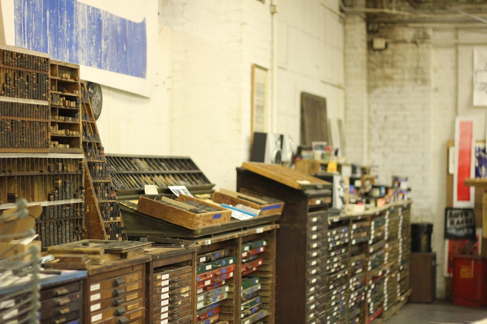
Whilst working as functional print shops the type remained organised but as letterpress has slipped into obscurity the cabinets of type have been thrown away. The drawers have been emptied into boxes. The finely organised wooden furniture has been burnt. The lead spacers have been melted down for scrap or thrown away due to their awkward weight. If anything has been a saving grace for letterpress it is that (you would hope) even a lay person (I feel like a snob saying that but for once it is in it’s right context) would be able to look at a box of wooden type and see a basic beauty in their form, that and the fact that everything to do with the trade is so damned heavy and awkward to move. With the Type Museum gaining exposure, old printers (and in some cases old printers families) have been excited to find somewhere to donate their old presses and jumbled boxes of type to.
And so this is where you find me; sat amongst boxes and drawers, caked in dust in the huge back room of the Museum with a big smile on my face. One of my roles here has been to start sorting the donated type so that at one point it may be correctly organised, archived and integrated into the collection in the future.
This isn’t so easy when a draw of donated type often looks like this.
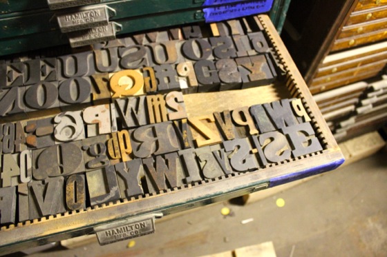
I genuinely enjoy sorting type, there is something quite therapeutic to it for my design addled dyslexic brain – like I can disengage the conscious part of my brain and just operate seeing the world as shapes. So after a day or so of labelling and sorting these random drawers (called “sorts” funnily enough) I was in some cases able to look at 4 cases of sorts, identify the different type faces across spread across all of them and then repack the 4 cases with a different design of type within each.
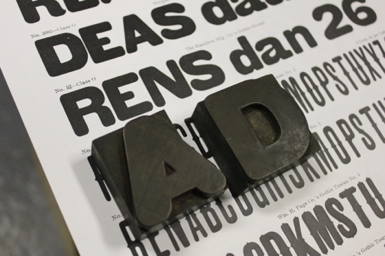
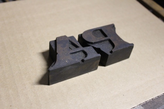
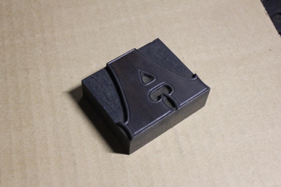
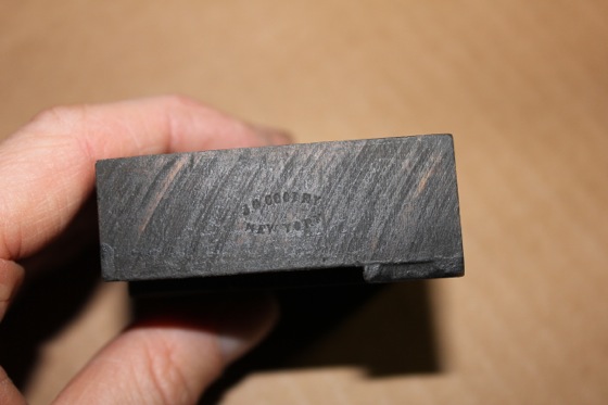
Now when I said that individual type was not labelled, there is in fact an exception. Sometimes in a font one of the “A“s will be stamped with a makers mark. However this means of identification is not a not consistent one, for a start most type will not be a full set so there may not be any “A“s there, if there are only 1 will be stamped. To make matters worse capital “A“s were often the kind of letter to have notch cut into them to allow for tighter kerning of letters like a “P”, as shown to the right.
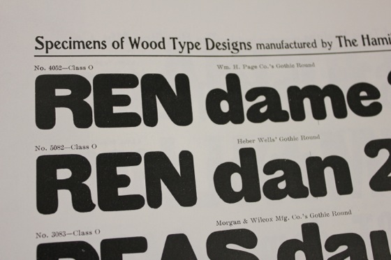
Having the makers mark allows you to do two things. For a start it gives you a rough idea of the age it was made, different marks for each maker were used at different points. If you have the specimen sheets (essentially a font catalogue) for a particular foundry you can identify them via.
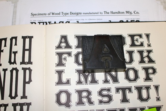
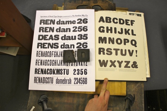
So with a long day spent sleuthing I was able to identify 3 different type faces from the archives by using a few different specimen sheets. It’s a nice feeling being able to know the name of a font, rather than just “gothic 12 line”.
This project has been especially eye opening to the many differences and quirks to type when seen in this context. Hamilton bought out a few other foundries and incorporated their collections into theirs. The Hamilton specimen sheet for each design of type lists at least 3 different variations for each design of type. When acting as rivals the foundries would produce type in similar styles (clarendon for instance) except each foundry would alter elements of the font slightly; a more pronounced serif, a lighter stroke width etc. In general these differences are only apparent when compared side by side, however occasionally the difference really jumps out at you. For instance the completely out of character spur on this capital “R“…not sure who thought that was a good idea.