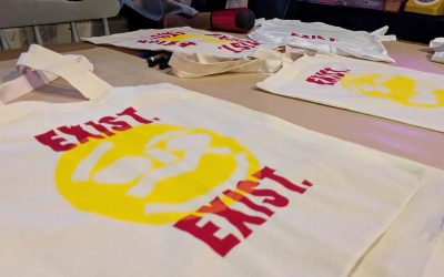
Skate and Create Screenprint Workshop
This month I was invited back to run another session as part of the Skate and Create workshops at Exist Skate Park. Skate and Create is an initiative to get childern exposed to different forms of creativity and is created in partnership with the Taliesin. The...
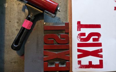
Skate and Create Letterpress Workshop
This month I was excited to be asked to run a Letterpress workshop for kids as part of the Skate and Create workshops at Exist Skate Park. Skate and Create is an initiative to get children exposed to different forms of creativity and is created in partnership with...
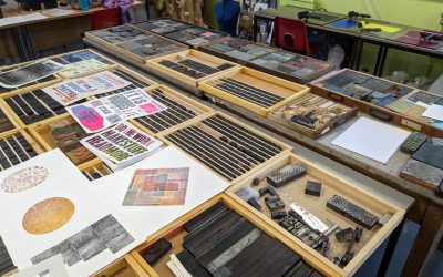
Mini Print Wales
"This was our first significant project following the impact of the Covid pandemic. With the focus of future-proofing not only SPW and our facility, but also printmaking within the wider creative community in Wales, our priorities were to attract a more diverse...
Examples Of Tools In Use
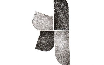
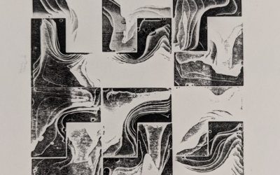
With my 4 initial tools finalised I was able to undertake a series of experiments to see how they could be used to create different forms. Letterforms created using the Blocks Letterforms created using the Randomiser Letterforms created using the Stencil Letterforms...
Blocks Development
With my digital tools progressing and the sets of components defined I have begun to make my final tool, the blocks. These are 3D printed blocks that can be printed with on a printing press. The components are all designed to relate to each other in terms of size,...
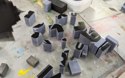
Stencil and stamp tests
One of the things that I identified earlier in the project was making tools that are accessible. Not everyone has access to a 3D printer, or to the printing presses required to use the 3D printed blocks. With that in mind I experimented with different physical ways I...
Open Collab – Typo Session
Open Collab is a experiment in digital collaboration. Throughout the month they put out an open call for submissions on a theme that are the randomly combined with other submissions to create new works of art. This month it was the Typographic Session and they asked...
Perception of Letterforms – The Brain and Gestalt Theory
My project focuses on the development of western letterforms based on latin alphabets. In the 2014 documentary about her by Edward Tufte, Inge Druckrey posits that "the classical Roman letter is the ancestor of all later formal developments of our alphabet." From...
Chaos Blocks
While printing a set of blocks for printing I ran into an unexpected problem. The printing of a set of blocks takes around 1.5hours, during which time I was teaching and did not realise the resin in the printing vat had begun to run out. The result was a failed print...
How We Learn and How We Teach Design
In her book Teaching Design, author Meridith Davis comments that todays "design fields began as trades, rather than professions" with many of the practical skills being acquired through making (2017). The rules of graphic design are not enshrined or enforced by any...